Easy Utility Classes For Vertical Centering
One of the earliest and most enduring holy grails in the coding of web sites has to do with vertical centering. Specifically, when you want a title / paragraph / image / ??? to sit in the dead center of the page. In the old days of fixed width websites, you could fakie around this by using padding along the top of the object, guessing that the user would have their browser open to a certain baseline width (ergo height) in order to pad enough to complete the ‘middling’.
Responsive development destroys that, we need a solution that can truly stretch and flex with the size of the users’ screens.
If we use table values for the display rules, we can center elements within each other, but changing a display:block to a display:table or a display:table-cell can cause conflict with rules including width and margin.
Easy Mac Vertical Centering Classes
CSS
We want to have a parent element set to display:table, the child element (to be centered) is set to display:table-cell, then given a vertical-align:middle that does the vertical centering magic. The parent element should be fully maximized for width and height, filling all available space.
These are utility classes that I’ve been including in my last few projects, and it does make life a LOT easier in writing markup if you’ve good some good utilities in your hand (just like Monopoly).
Using Our Utilities In Structure
HTML
There are two ways of including the classes with your elements.
The first follows the spirit of the display issue, and we are using two additional <div> elements in our structure to include them. This does not require any changes to existing styles defined for the <section> or the <p>. The div.center-frame fills all space available within <section>, the div.center-piece is like cling wrap around our <p> element, which will now be centered within the section.
The advantage here is that you can blend this in easily with existing styles and structures, the <section> and <p> can still be set to display:block or display:inline-block.
The second method, far far simpler, is to apply our utility classes directly onto our elements themselves, and this is preferred if you have a very simple structure and a very simple need. An <img> or a <p> can be centered in the browser easily, replace the <section> with a <body> and that is your full screen browser centering solution.
See the Pen by Dan Cruzat (@DanCruzat) on CodePen.
Drawbacks
This method uses CSS table rules applied to non-table elements, it’s a halfway to a cheat in how the languages interact. Most modern browsers (ie The Ones We Care About — ironcially not IE) will recognize these rules and play ball.
The goal here is something that works as broadly as possible across browsers and devices, and thankfully we are at a point of General Consensus where we can build and style on a solid standard across the board.
This won’t work in older versions of Internet Explorer, but see previous statement about browsers we care about. You can offer support for IE7, IE8, IE9, or IE-Whatever after Microsoft launches their next piece of shit browser, but that is definitely a value-added that should be calculated into a project AFTER primary dev and styling are complete, UNLESS you are building specifically for IE, in which case I pray for you.
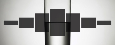
There is a great balance in having something float in the middle of the screen, or having a caption float centered over an image, and this is an easy mac answer that has worked well for me. There are other answers out there (CSS Tricks links in foot are greatness), please leave yours in the comments if you’ve got a good one.
More on Vertical Centering
Related CSS
Buy Monie Love Down to Earth on Amazon.
Malcolm in the Middle is property of Satin City Productions, Regency Television, 20th Century Fox Television.